Daily UI Prompt: "Design a credit card checkout form or page. Don't forget the important elements such as the numbers, dates, security numbers, etc."
MY PROCESS
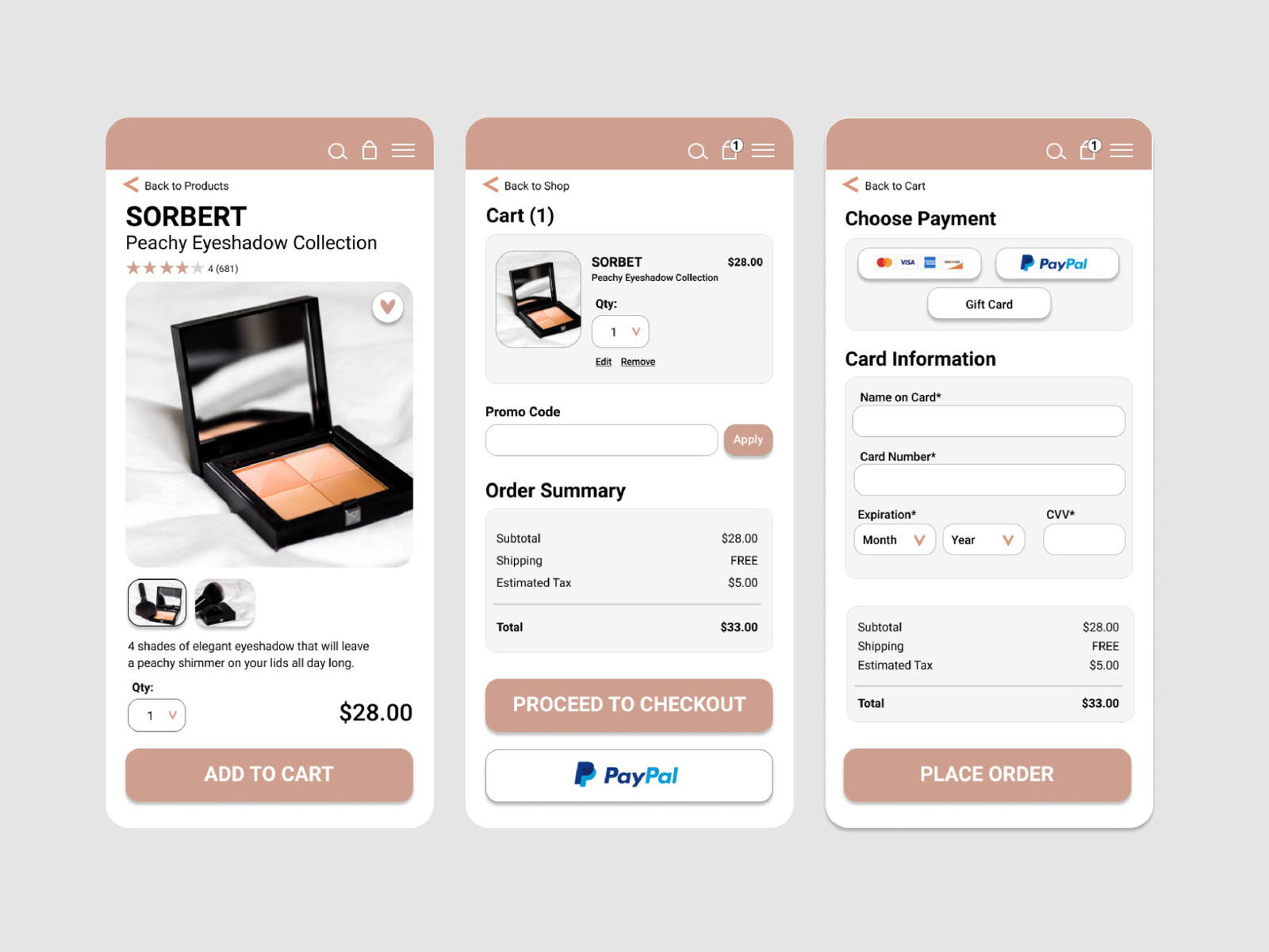
I designed a product page, a cart page, and a checkout page for a makeup product.
In order to get an idea of how these pages tie together though, I looked for inspiration on dribbble, and then more importantly shifted my focus on researching existing websites with shops. I looked up well-known companies such as Walmart, Nike, and H&M to examine similarities in their product layouts and shopping cart pages.
As I browsed the products on these company's pages, I noticed that they all include these items:
-multiple images of the product
-a price
-a "favorite" button
-a section to fill in the product quantity
-a "add to bag/cart" button
-stars for reviews
-promo code sections
-product descriptions
Because I focused on makeup, I looked for images on Unsplash** (credit listed below) that showed multiple perspectives of the same product. I then well-known makeup companies such as MAC Cosmetics, Sephora, NYX, and Anthropologie to get a feel for their web design styles and to see if there would be any distinct design characteristics or patterns on these pages that wouldn't be on non-makeup pages. I noticed that some of these pages included a section to change the color of the makeup depending on the type of product, but otherwise the web designs for these makeup companies weren't too different than one for non-makeup companies.
CART PAGE RESEARCH
During my research phase, I clicked on the "add to cart" buttons on each website to see the cart page designs. I noticed that the photos of the products were much smaller on the cart page than on the main product page. The cart page also included a section that includes the quantity, the price, an order summary that includes sales tax and shipping costs, and then two buttons: one that says something along the lines of "checkout" and one that opens up PayPal.
CHECKOUT PAGE RESEARCH
Ironically, I struggled with easily opening up an actual credit card checkout page. This is because many of these companies want you to have an account in order to proceed to checkout. Thankfully I was able to proceed to checkout on sites that had a "continue as guest" option. There, I noticed sections to fill in your address and credit card information. For my design I skipped that section and only focused on designing the credit card information section.
While looking at credit card sections on different sites, I learned that I needed to include several payment options at the top: one for credit cards (with a tiny image of credit cards), one for PayPal, and one for gift cards (optional). I took note of all of the sections that users need to input, such as card number and expiration date. On the checkout pages I also noticed the order summary again, and a "Place Order" button beneath that information.
Based on my research I incorporated these patterns and items into my ui designs!
BACK WITH FRESH EYES
After a few weeks away from this project, I looked at the first page again with fresh eyes. The right information is on that first page, but it looks squished together when it should be more spaced out and scrollable. So, I did that- I made it scrollable, both vertically and horizontally! I also added in components that are ordinarily on a product page such as images of products that "others like" and product reviews.
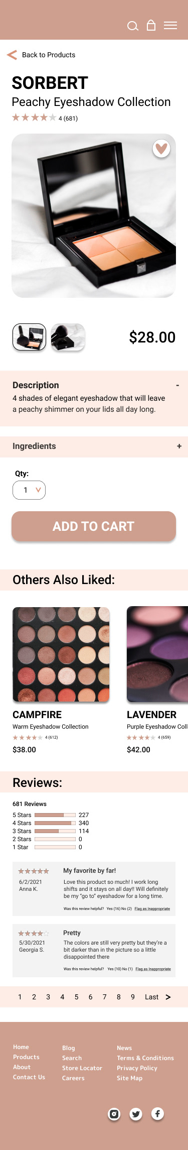
Image Credit:
**makeup images by Laura Chouette on Unsplash:
https://unsplash.com/@laurachouette
**makeup images by Laura Chouette on Unsplash:
https://unsplash.com/@laurachouette