I designed music player pages for a Daily UI project, but I got really into this so I spent a few days on it. :)
Design Process
I started off by my design process by looking at other music designs. I analyzed the layouts on Spotify and iTunes to get a good understanding of 1) the elements that I liked on those pages, and 2) new elements that I wanted to see implemented in my design that were not yet on Spotify's interface.
To get the music juices flowing, I created a wireframe of the layout idea I imagined.
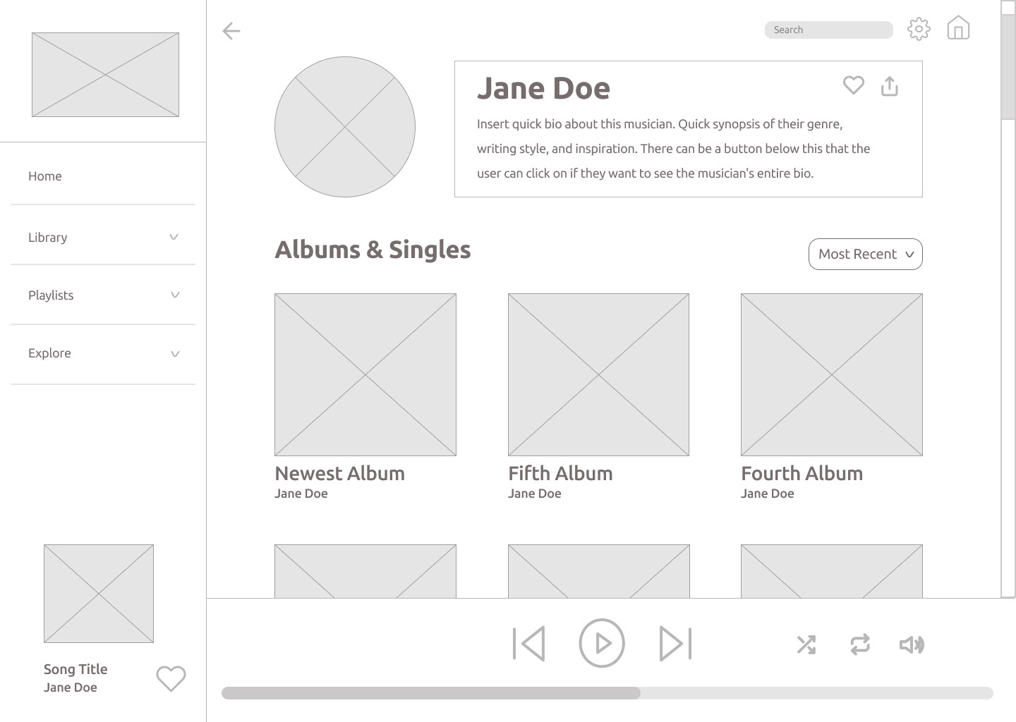
As you can see in the wireframe above, I outlined the essentials. Similar to Spotify's design layout, I included a sidebar with important information on the left side of the page. I added in arrows next to each word on the sidebar so that each section would collapse and allow items, such as titles of playlists, to be hidden. I did this because I think the sidebar looks cluttered when you can see every playlist on the sidelines. I don't want to be jamming to a new playlist in 2021 and look over and eye a playlist from 2016 that doesn't suit my music taste anymore. Could I just delete that playlist from 2016? Sure, I guess so. But I'd rather hide it than delete it completely.
I also wanted to focus on introducing the musician with a little summary before getting into the albums. One thing that I don't like about Spotify's layout is that it tucks their musician's "About" information all the way at the bottom. I know the music is supposed to be the main focus, but the musician makes the music, so I thought it would be appropriate to include a tight musician's summary at the top.
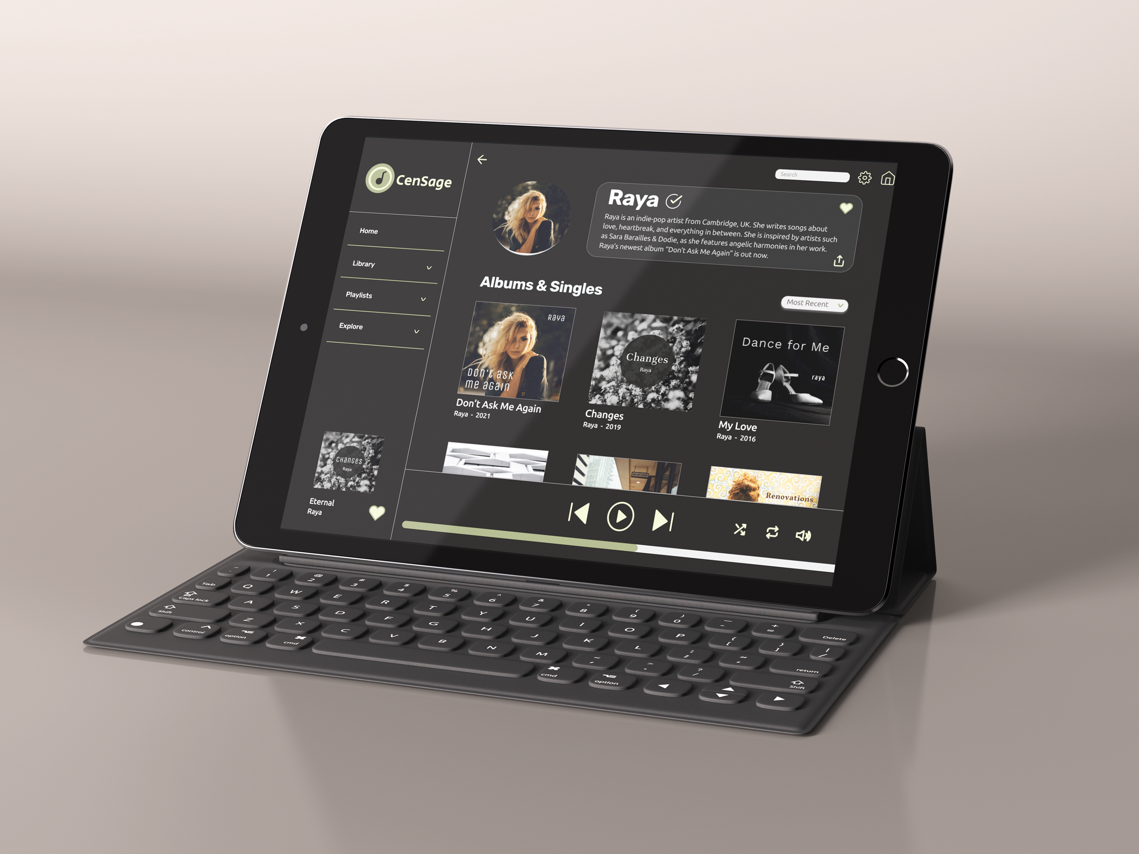
Drum Roll, Please! *Drum Roll* ... Here comes the First Round of Designs!
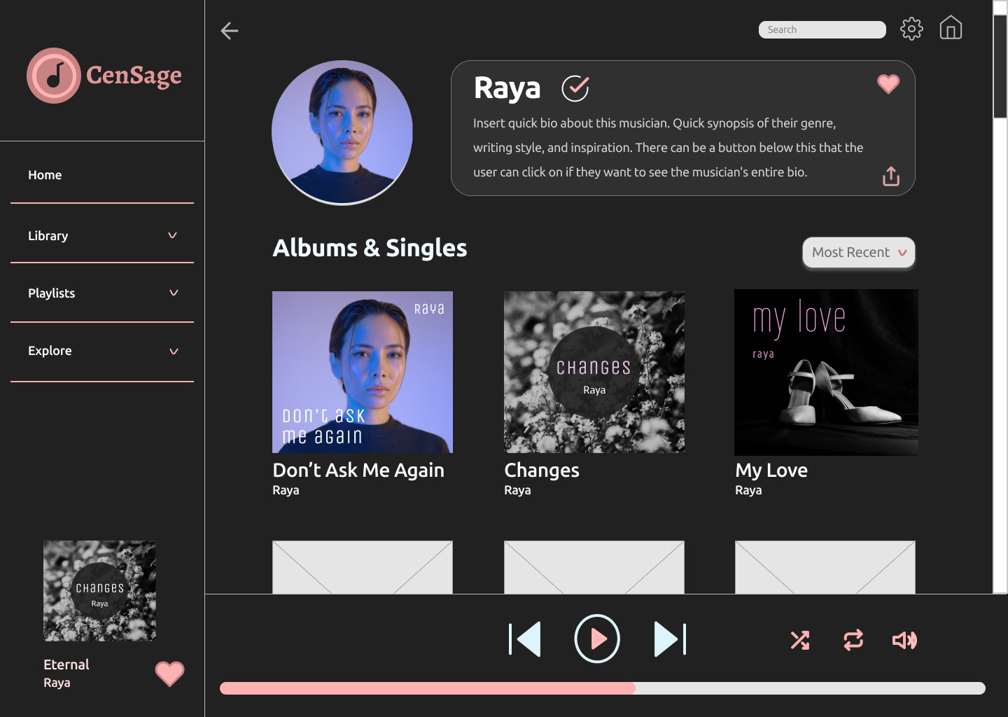
I loved how this design came out! I had a lot of fun making album covers for this "musician" and coming up with a logo (info about it is below). But something felt a bit off about the colors. I realized that pink didn't feel neutral enough, as it distracted from the overall design. Determined to solve this color conundrum, I inserted a photo of a different woman into the icon spot which confirmed that the colors in that photo definitely clashed with the pink elements. From there, I changed the colors from pink to variations of sage green.
Another Drum Roll, Please! *Drum Roll* ... the Second Round of Designs!
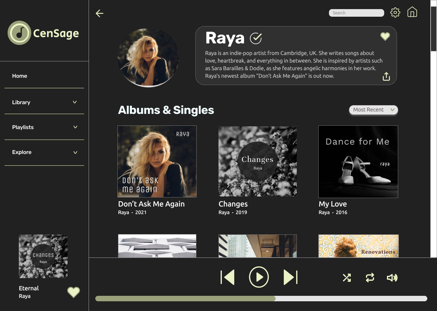
Muuuch better.
As stated above, I adjusted the color palette so it wouldn't stand out so much. I went from pink to sage green, because it visually represented a state of calm, and I thought that captured the brand better than before.
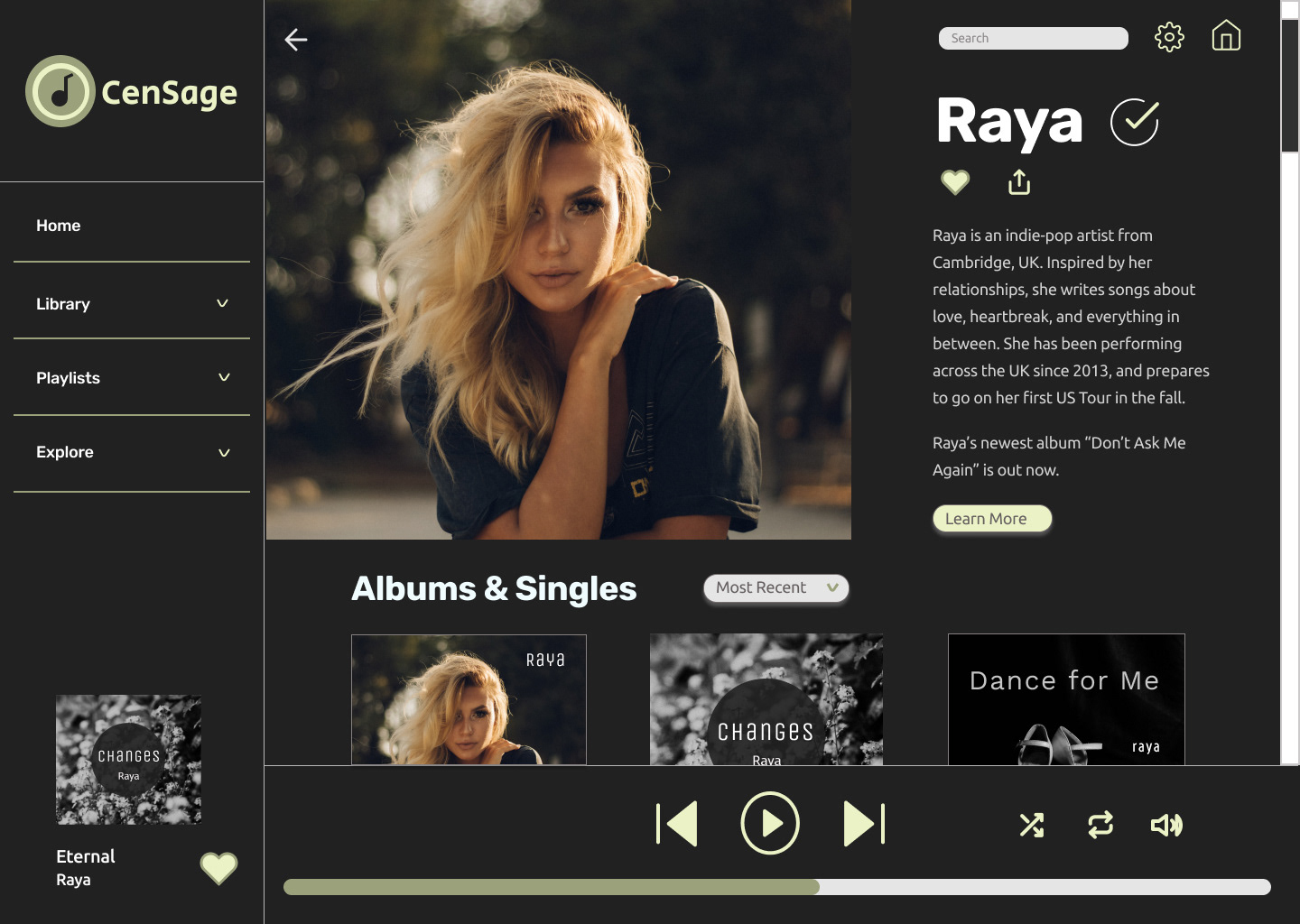
Here is another variation of the layout. I decided to make the musician's photo and her summary stand out much more. The user would need to scroll to get a better understanding of the music she has released, but I like this option because her photo stands out and says, "This is me! Learn a bit about me first before diving into what I've created."
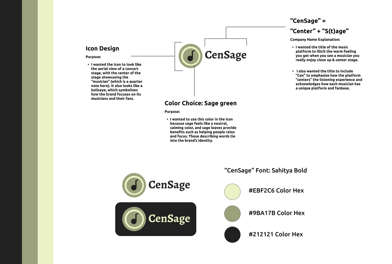
Brand Identity / Visual Elements
Reflections
Overall, I enjoyed working on this project and learned a few things along the way:
1. When I get excited about a project, I dive in deep. I mean, this challenge was supposed to be a daily challenge, not a three-day challenge! I had so much fun designing the albums, writing musician summaries to tie into the interface design, and creating a brand for this company idea.
2. Brand identity ties the entire design together! Pink looked pretty at first, but it didn't mean anything, and it clashed with images that weren't pink or purple. Although I developed the "brand" after I created a layout, it allowed me to develop a better understanding of why I was designing in the first place. I grew more confident in matching a brand with a design after doing this.
3. It's important to research existing designs. It's one thing to look up other peoples' designs on here and on dribbble to gather inspiration, but seeing "live" designs helped me understand what has worked in the past and what can be improved in the future.

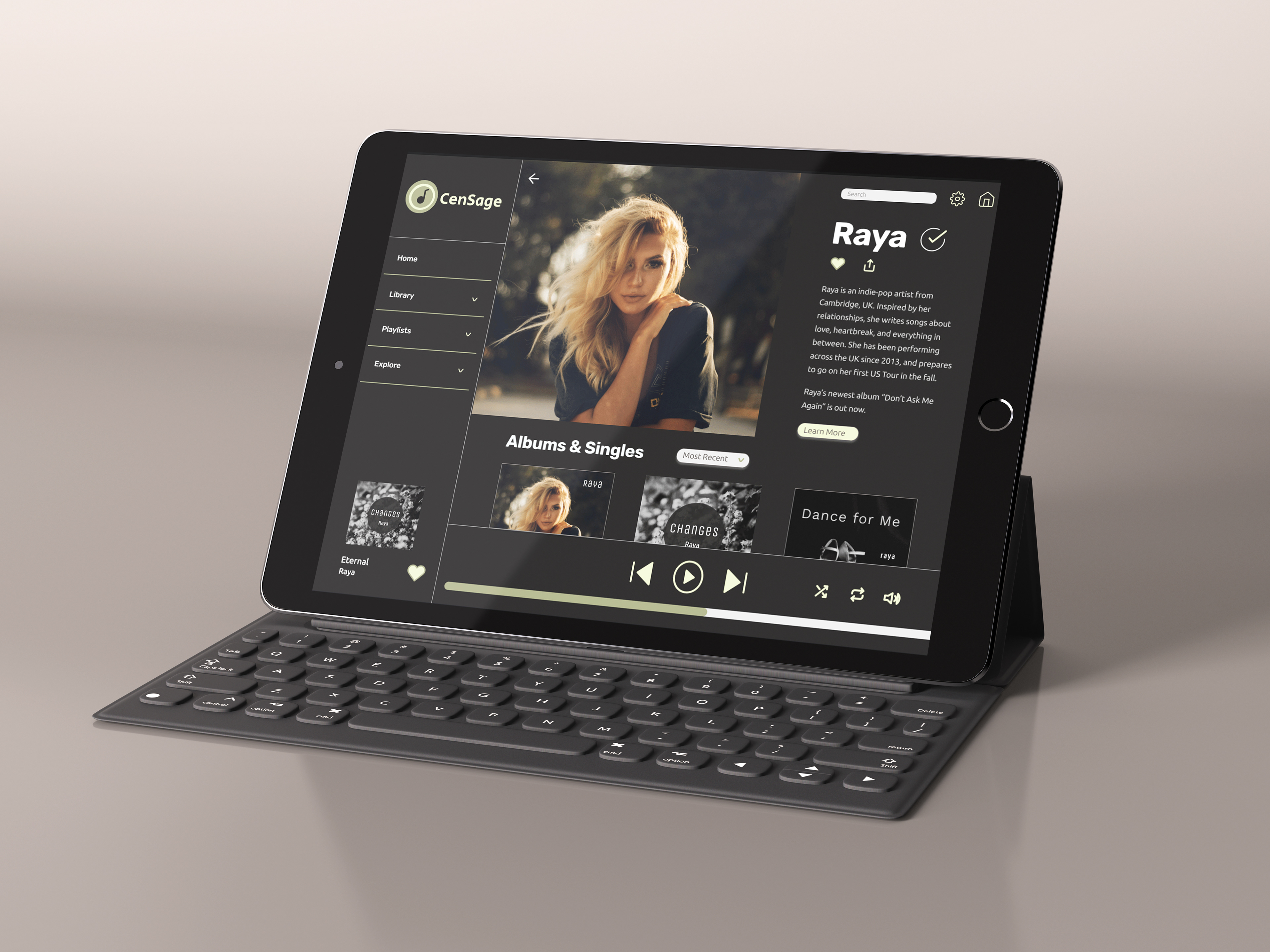
Image credit:
- Photo of iPad mockup "Realistic iPad Pro Mockup Vol.3" by Anthony Boyd:
https://www.anthonyboyd.graphics/mockups/realistic-ipad-pro-mockup-vol-3/
#anthonyboydgraphics
- Photo of iPad mockup "Realistic iPad Pro Mockup Vol.3" by Anthony Boyd:
https://www.anthonyboyd.graphics/mockups/realistic-ipad-pro-mockup-vol-3/
#anthonyboydgraphics
- Photo of "Raya" by Ivan Dodig (@id99) on Unsplash:
https://unsplash.com/photos/R21SyyJDFgc
https://unsplash.com/photos/R21SyyJDFgc
- Photo on "Changes" album art by Annie Spratt (@anniespratt) on Unsplash:
https://unsplash.com/photos/kc3gq84X4y0
https://unsplash.com/photos/kc3gq84X4y0
-Photo on "Dance for Me" album art by Krystal Ng (@artokree) on Unsplash:
https://unsplash.com/photos/XSEvOX6UI5E
https://unsplash.com/photos/XSEvOX6UI5E
Other album cover art on second row (from left to right):
-Photo by Paul Fiedler on Unsplash:
https://unsplash.com/photos/rQ2Irvd-ALs
-Photo by Paul Fiedler on Unsplash:
https://unsplash.com/photos/rQ2Irvd-ALs
-Photo by Wes Hicks (@sickhews) on Unsplash:
https://unsplash.com/photos/IUsUeQKeUhg
https://unsplash.com/photos/IUsUeQKeUhg
-Photo by Cristina Gottardi (@cristina_gottardi) on Unsplash:
https://unsplash.com/photos/ZM4eXAOsjCU
https://unsplash.com/photos/ZM4eXAOsjCU